The Product
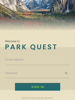
An application dedicated to national parks that enables users to create activities and itineraries, save and share them with friends.
The Problem
Outdoor enthusiasts navigating national parks often encounter the daunting task of finding reliable information. and piecing together fragmented information from various sources to plan their visits. Without a centralized platform, they struggle to curate personalized itineraries tailored to their interests and preferences.
The Goal
To offer a user-friendly interface that integrates a wealth of park information from other users, provide personalized itinerary-building tools and empower users to plan and navigate their park visits with confidence.
Tools
-
Figma
Team
-
1 UX designer
My Role
-
UX design
-
UI design
Timeline
-
Overall: 4 Weeks
MY DESIGN PROCESS
1
2
3
4
5
6
Persona
Sketches
Wireframes
UI Design
Next Steps
Learnings
PERSONAS
At the project's outset, my ideas for this application were overflowing. However, due to time limitations, I faced the difficult task of refining my focus to craft a Minimum Viable Product (MVP). To aid this process, I developed four personas, serving as guiding beacons throughout the design journey. These personas proved invaluable in discerning which features were essential to my target audience, ensuring a more targeted and effective design approach.
Persona 1: Kate Austin
Problem Statement
Despite the inherent challenges and uncertainties that accompany outdoor adventures with young children, Kate remains undeterred in her commitment to fostering a love for nature and instilling a sense of wonder and appreciation for the outdoors in her children. She approaches each trip with unwavering optimism, resilience, and determination, embracing the journey with open arms and an adventurous spirit. For Kate, the rewards of witnessing her children's laughter, curiosity, and sense of wonder amidst the majesty of nature far outweigh the challenges and obstacles along the way.

Persona 3: Daniel Brown
Problem Statement
Daniel, aged 40, has been immersed in the world of backpacking and camping since the age of 15. With a deep-rooted passion for the great outdoors, he now seeks more advanced experiences within national parks. Always chasing the adrenaline rush, he eagerly seeks out fellow outdoor enthusiasts who can guide him to the most thrilling spots. Despite his extensive experience in most parks, Daniel wishes for a way to share his wealth of knowledge with others, hoping to inspire a similar love for nature in fellow adventurers.

Persona 2: Ethan Taylor
Problem Statement
Ethan, seeing a blog online about how amazing the national parks are, has decided he wants to take a trip this summer. Unfortunately, because he has never been to one before, he is hesitant to actually go. He’s not sure what gear he needs in order to camp out and he’s not sure where the camp grounds even are. Ethan is looking for a map and a few suggestions on activities as well as essential gear. Unfortunately, there is nothing out there so he hasn’t gone to a national park yet.

Persona 4: Eloise Hawking
Problem Statement
Eloise, a UX designer who leads a busy lifestyle in the city. Despite her demanding job, she is passionate about outdoor adventures and tries to make time for hiking and camping whenever possible. She enjoys exploring new trails, immersing herself in nature, and capturing stunning photographs along the way. However, Eloise often struggles to find reliable information about hiking routes, camping facilities, and park regulations, leading to uncertainty and frustration during her outdoor excursions.

Sketches
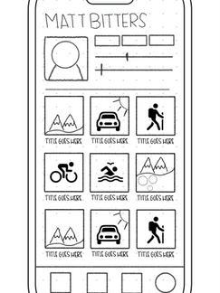
I started with pencil sketches to get ideas on paper quickly. My application is 50% visual and 50% informational. In my designs, I created 2 layers of information. Layer 1 is visual and layer 2 is informational. I didn't want to overwhelm users so for that reason I chose to show visuals as the first layer to peak users interest as well as guide them through the application. After choosing a national park to look into, users are met with top 10 lists that have pictures attached to each item, showing them what types of information is available and giving them a mental picture of what a guide or activity would look like. They can click on each item to view more information.
To give users more information about the authors of activities or itineraries, I created profile pages that display any content they have published on the site as well as a profile picture. In my design I created a "tag" concept. "Tags" can be any combination of words that describe their outdoor style, personality or words to describe their itineraries or activities. This gives the user a quick way to browse which guide is a fit for them and if the content on the guide's page is worth looking into.
Wireframes
Once I got ideas onto paper, I moved to Figma and started wire-framing and refining my ideas. I combined the itineraries and activities section on the profile page. I also added a background hero image to the top of the profile page.
UI DESIGN
High Fidelity Round 1
Once I got my designs refined I applied color, type and other elements to the UI design. I chose Poppins as type because it has a large X height which makes it easy to read, and contributes to good accessibility. For secondary type I used Architects Daughter because it has the feel of someone writing a note and leaving it on a trail. This type expressed "outdoor" and "personal" and "informal" feel. This was important because users will be able to list themselves as guides and as a guide you are sharing your own personal ideas and opinions. I wanted users to feel connected to their guides. I chose Montsserat to pair with Poppins as the paragraph text.
For the color palette I chose to use shades of brown, orange, blue, and green to reflect the elements of the national parks. This selection isn't just about aesthetics; it's about evoking emotions when users are using the application—feelings of serenity, anticipation, excitement, adventure and a connection with the great outdoors. By immersing users in these familiar hues, the design delivers an authentic experience that resonates with their outdoor adventures, elevating their engagement and enjoyment of the application.
NEXT STEPS / CALL TO ACTION
Continuing on with this project, I will be conducting usability testing with a few participants. This testing will allow me to gain insights into how users will interact with the application. By gathering feedback and insights from real users, we can identify strengths, weaknesses, and areas for improvement.

01
Continuing on with this project, I will be conducting usability testing with a few participants. This testing will allow me to gain insights into how users will interact with the application. By gathering feedback and insights from real users, we can identify strengths, weaknesses, and areas for improvement.
02
Iterative Design Refinement: Use the insights gathered from user feedback to iteratively refine the design and functionality of the application. This may involve optimizing user flows, improving visual elements, enhancing navigation, and addressing any usability issues to create a more intuitive and engaging user experience.
03
Feature Expansion: Add new functionalities such as enhanced influencer capabilities to provide a monetary gain and persuasion to use the application.
WHAT I LEARNED
Throughout this project, I had difficulty figuring out the user flow and bottom navigation. I wanted to keep the navigation minimalistic which meant that the screens needed to be very intuitive. I learned that sometimes the only way you can ensure that your screens and interactions are intuitive is by testing them.
I also learned that it's the little details that matter. The icons, specific images and gradients that you use that make the difference between a good design and a great design. Moving forward with the project, I am going to make sure that there is a reason behind every icon. I am also going to use the testing feedback to ensure they're in the right location and I am going to add those small touches like shadowing and gradients to the photos and other elements.


